
Student Project
EDS is widely misunderstood, underdiagnosed, and often dismissed — especially among younger people seeking answers for long-standing symptoms. The challenge was to create a campaign that felt inviting, digestible, and culturally relevant without minimizing medical seriousness.
The Ottawa chapter needed a visual system that could capture attention, explain the issue quickly, and resonate emotionally across posters, postcards, and social media. For me, the challenge was also rooted in lived experience: I know firsthand how exhausting the diagnostic journey can be. The campaign needed to validate that reality while offering hope, clarity, and connection.
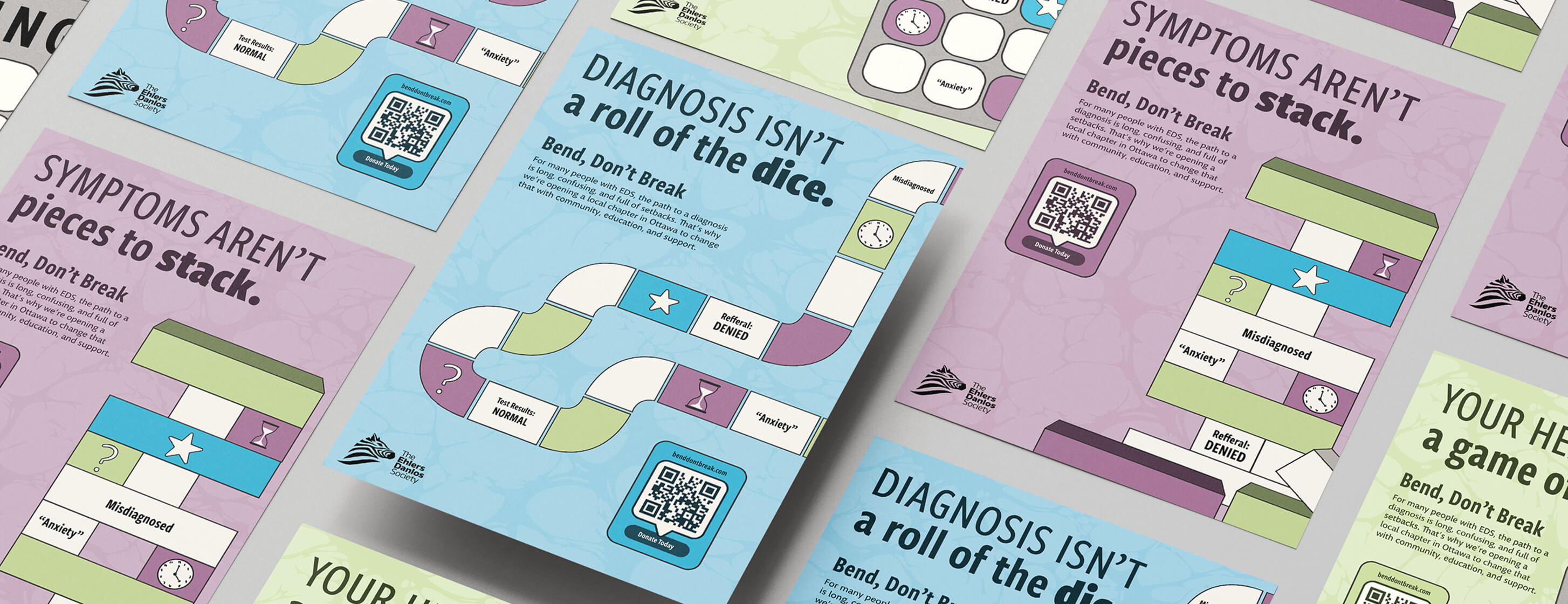
Research into patient experiences, diagnostic delays, and community needs revealed a consistent theme: for many, the journey to diagnosis feels like navigating an unpredictable game. That insight shaped the conceptual direction and informed the entire visual language.
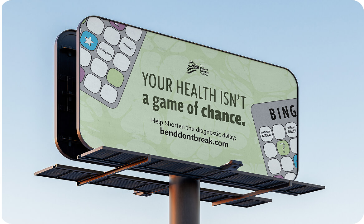
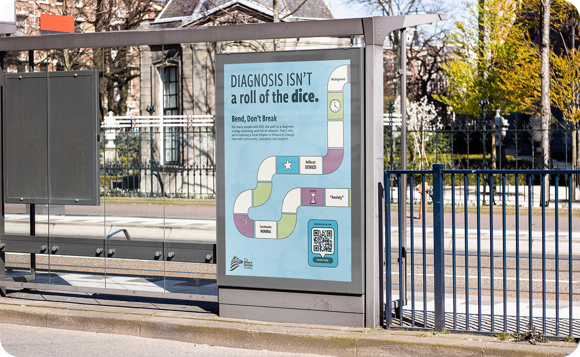
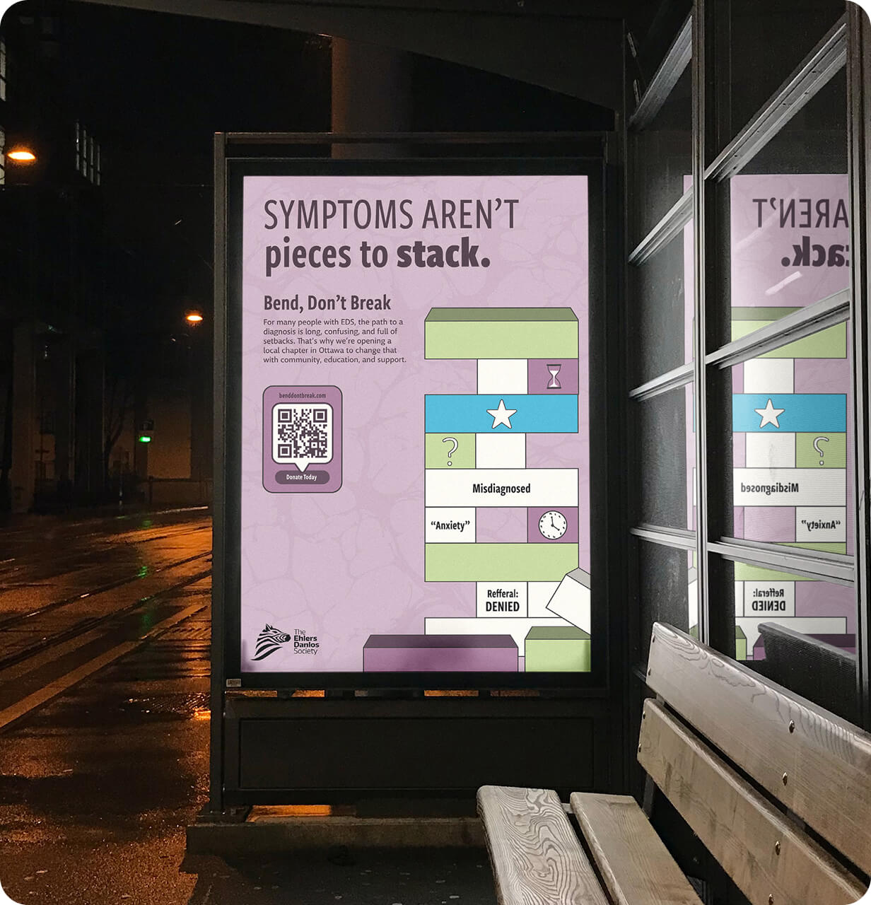
Three game-based metaphors became the foundation of the campaign:
Each visual direction was paired with short, punchy headlines. These were crafted to be memorable, shareable, and emotionally resonant while remaining clear and factual.
Through iterative sketching, layout development, and colour exploration, the campaign evolved into a cohesive visual system aimed at younger audiences.


The final campaign combines bold illustration with straightforward messaging to create an accessible, visually cohesive system built around metaphor and clarity. The playful game visuals draw viewers in, while the supporting copy emphasizes lived experience, validation, and awareness.
Across posters, postcards, and Instagram carousels, the campaign supports the Ottawa chapter’s mission to reduce diagnostic delays and increase awareness of EDS in the community. It succeeds by balancing approachability with honesty, being playful enough to engage while serious enough to inform, and cohesive across both print and digital formats.
This project was also personally meaningful. Designing from lived experience challenged me to translate frustration into purpose, using visual storytelling to advocate for a condition that often goes unseen. Feedback emphasized the campaign’s clarity, relatability, and polished execution, reinforcing the value of designing with both strategy and empathy.
