
Student Project
Despite its popularity, the Libby app presents several usability issues that slow readers down. Menu icons are difficult to interpret without labels, search is limited to one library at a time, and common tasks like managing holds require unnecessary steps. Inconsistent interactions across tabs, such as book covers opening different elements depending on the page, create confusion and disrupt the reading experience. The challenge was to streamline these core interactions, reduce cognitive load, and bring clarity and consistency to an app many users rely on daily.
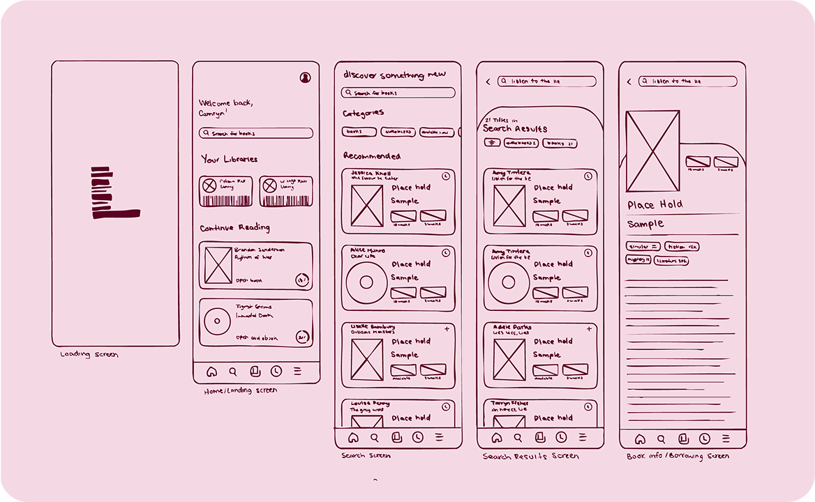
The process began with a comprehensive evaluation of Libby’s existing interface. I mapped out user flows for searching, borrowing, managing accounts, and checking holds, identifying moments where the app’s structure slowed readers down. Several themes quickly emerged: unintuitive navigation, fragmented search, inconsistent interaction patterns, and a hidden holds system.
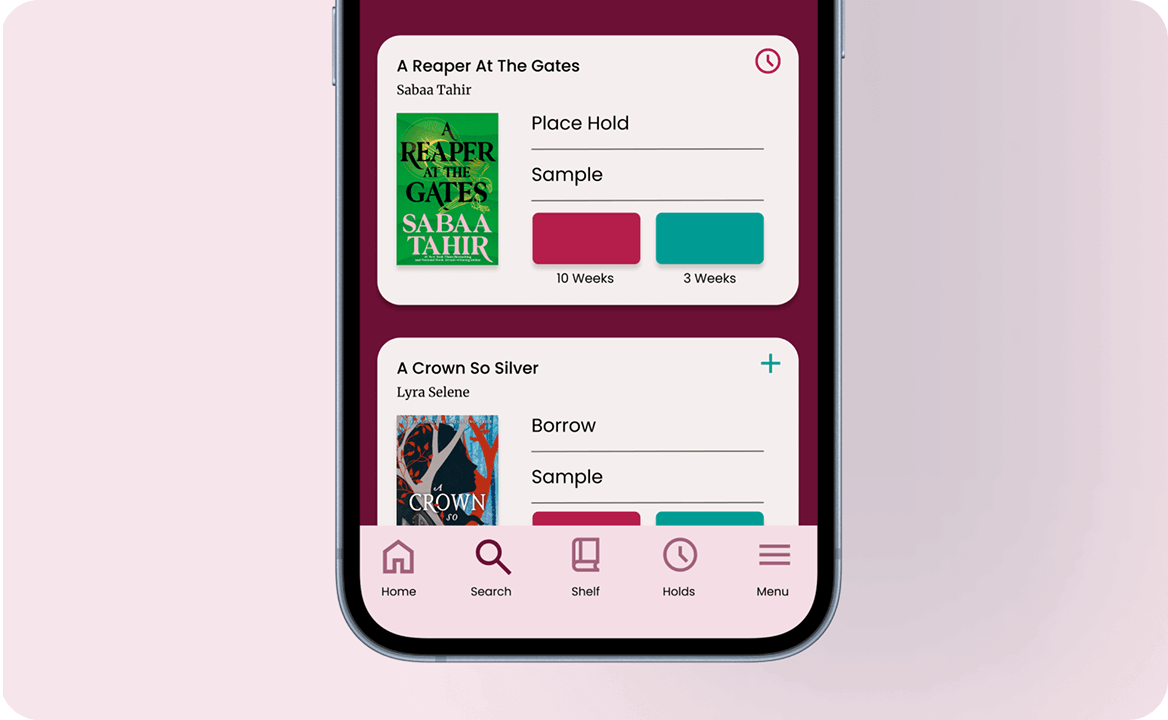
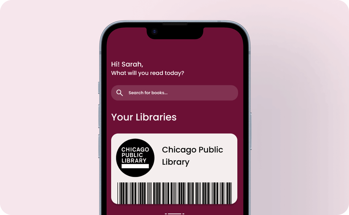
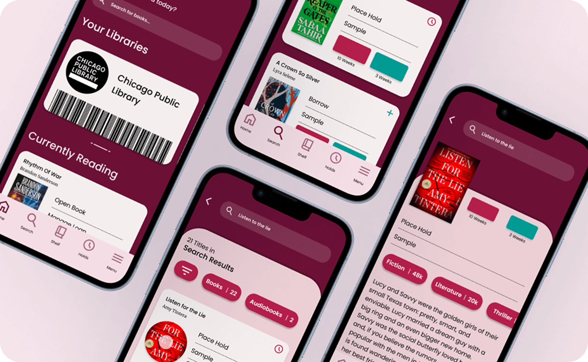
Using these insights, I reorganized pathways to support a more intuitive reading experience. Key improvements included:
This research-driven refinement ensured every change directly addressed a documented pain point, resulting in a more predictable and user-friendly structure.
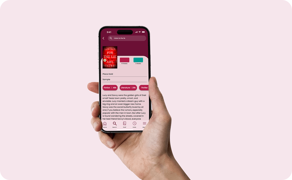
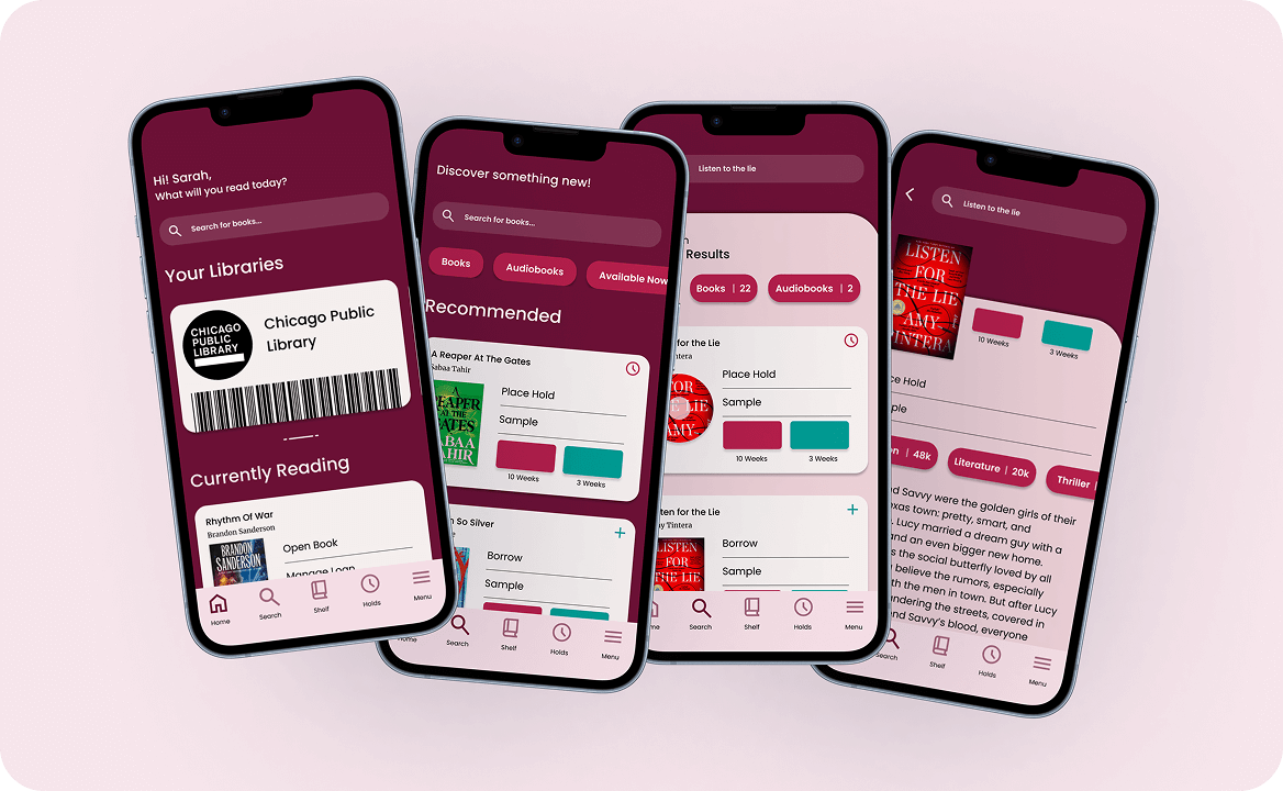
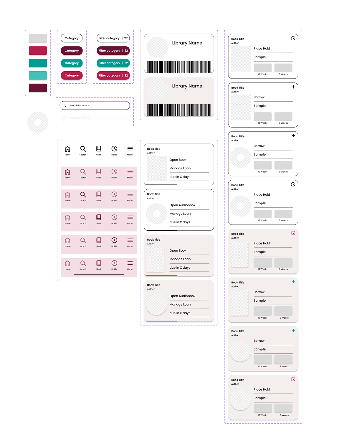
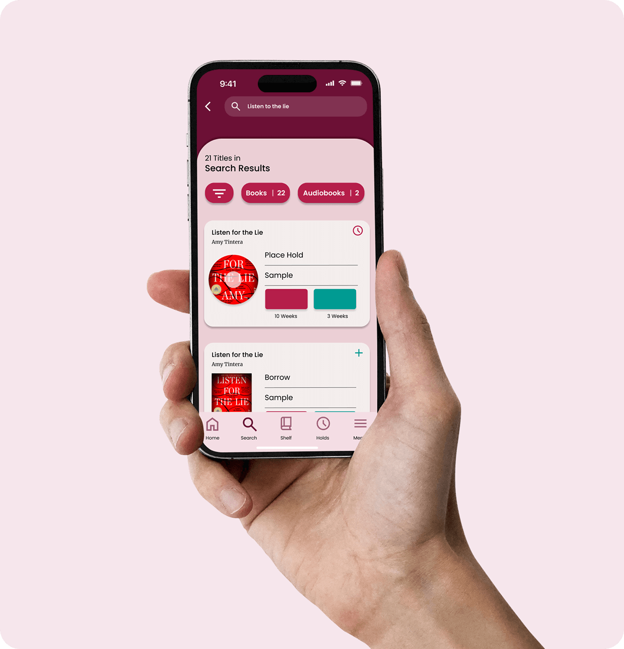
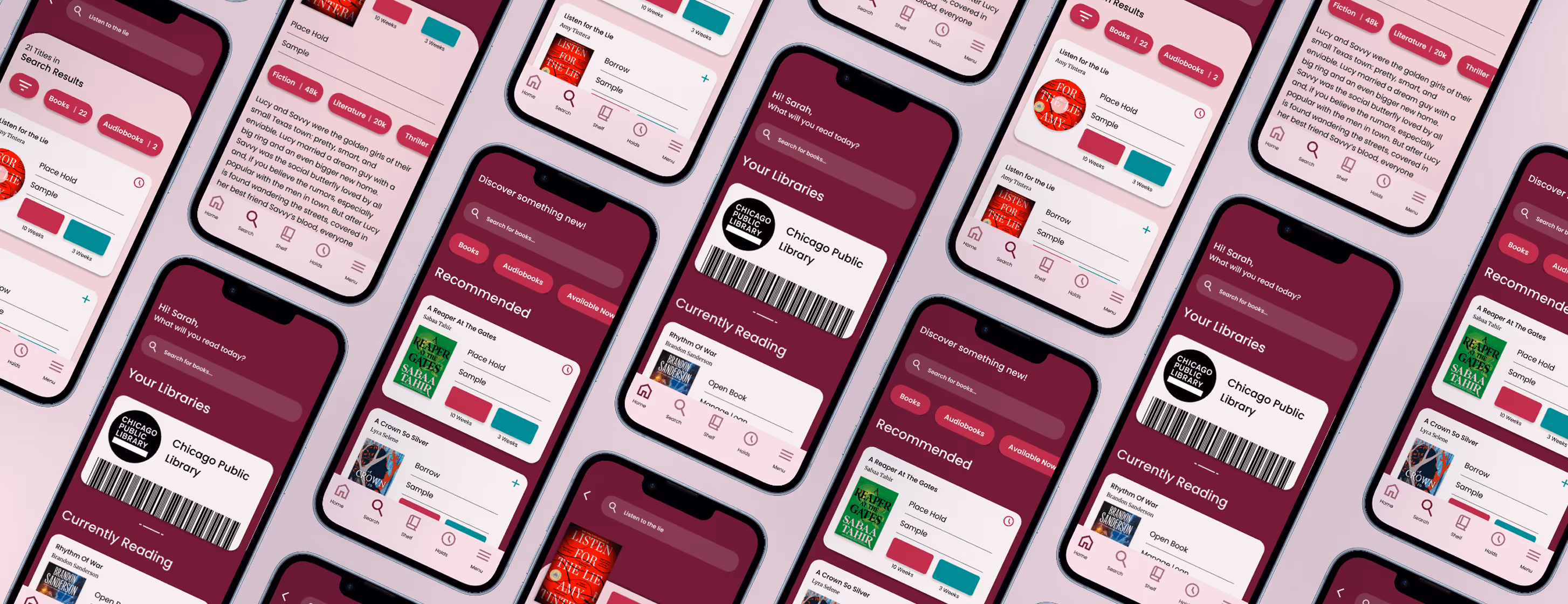
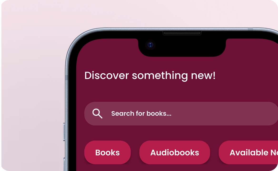
The final redesign brings clarity, consistency, and ease to Libby’s reading experience. A labelled navigation bar improves discoverability, unified search reduces repetitive tasks, and consistent behaviours help readers feel confident in their actions.
This project deepened my ability to translate UX research into purposeful design decisions. The refined Libby experience restores simplicity and reliability to digital borrowing, letting readers stay focused on the stories they love, not the interface around them.

.jpg)