
Student Project
LiveBy Pilates’ original logo lacked the polish and flexibility needed to reflect the studio’s quality of instruction and calm professionalism. The challenge was to create a new identity that captured a sense of movement, mindfulness, and balance while maintaining consistency across both digital and print applications. The new brand also needed to reflect the studio’s personalized and inclusive approach, embodying the thoughtful care it provides to its community.
The process began with market research and brand analysis to define LiveBy Pilates’ audience and positioning. The studio primarily serves women aged 25–50 seeking mindful, low-impact exercise for strength and stress relief. Competitive analysis showed a clear divide between studios emphasizing luxury minimalism and those promoting athletic intensity. This created an opportunity for LiveBy to occupy a middle ground — a brand that feels calm, human, and strong, combining professionalism with approachability.
A review of existing materials revealed inconsistencies in typography, hierarchy, and tone, signalling the need for a unified brand system. From this foundation, I explored concept development through extensive sketching and iteration. Two primary directions emerged:
After testing both directions across formats and colour variations, The Mind-Body Connection was selected for its versatility and ability to represent LiveBy’s focus on balance and renewal.


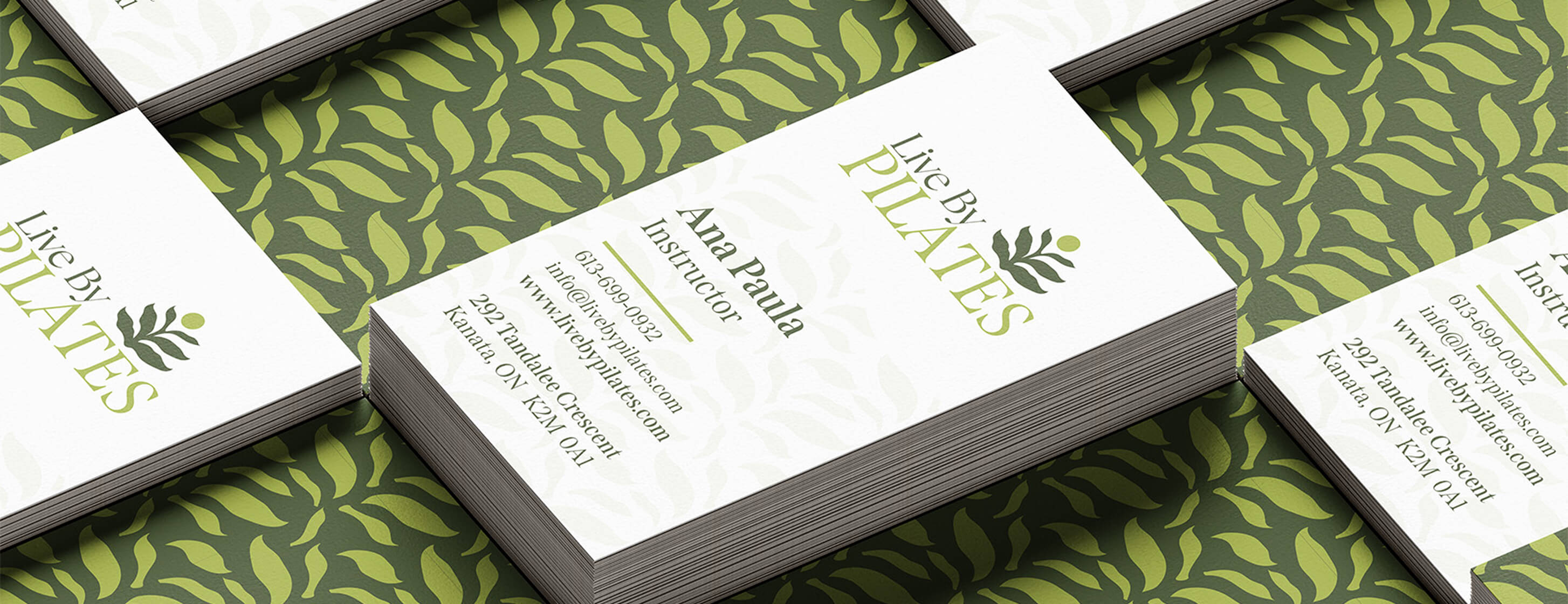
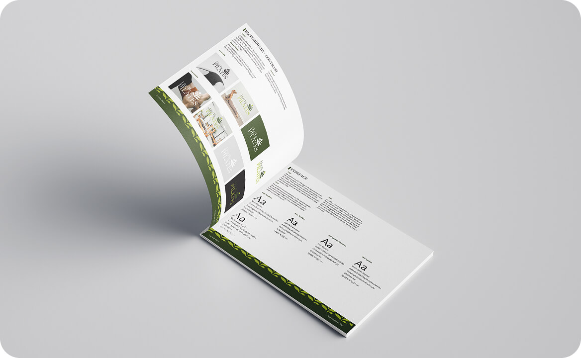
The refined LiveBy Pilates identity strikes a balance between calm structure and natural flow, capturing the mind–body connection at the core of Pilates. Its organic mark and soft green palette convey renewal, balance, and grounded energy, resulting in a brand that feels mindful, trustworthy, and refined.
This project strengthened my ability to connect strategy with visual storytelling, guiding every stage from research to execution. Working independently challenged me to justify each design decision with purpose and intention, ensuring the final identity was both conceptually grounded and visually cohesive. Feedback highlighted the rebrand’s clarity, symbolic resonance, and polished presentation, reinforcing the success of a thoughtful, human-centered approach.
